Students Annual contest
Prof. Yarom Vardimon on the selection of the symbol of the Council for a Beautiful Israel
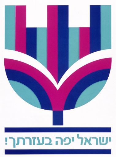
I was a member of the panel of judges in the contest for the Logo / Symbol of the Council for a Beautiful Israel. Throughout the process the Shamir Brothers' symbol in blue ultramarine stood out in its directness of message being constructed as an urban flower and two leaves, in symmetry, creating a kind of a "shield" as used in the contexts of status, class position and value. In the latter stages of the evaluation one of the judges indicated that he was afraid that the symbol was incomprehensible and it seemed that the selection of its design would not be possible. My attempts to justify it against the background of history as well as of the period, just like the choice of the blue flag of state, did not succeed. Another member of the panel suggested adding a small stake to the bottom of the shield to make it clear that the flower emerges from among the leaves. In view of the circumstances, the proposal seemed interesting and provided the basis for further discussion until the decision was reached to accept the symbol with the proposed stem as a solution. The final decision was reached following my proposal to give the leaves a green colour, and so it was. In retrospect, it turned out that even this was not enough.
A short time later I was asked by the council management to offer something that would make the symbol clearer. The only way out, and clearly inspired by the spirit of the time, the Op Art, was the attempt to express the symbol not only in blue but in strips of colours. Decades later I discovered to my delight that it was probably decided to drop the stem and make do with the green leaves and the flower in Ultramarine.
Prof. Yarom Vardimon
Laureate of the Israel Prize


